Writing a chess app (4/9): Building a suite of components for chess applications in SwiftUI
When learning to program we probably all at some point ended up drawing a "chessboard" by learning about for loops. At least when I started to learn programming with Java this was a typical exercise.
Unfortunately it takes a little more than two for loops to build a chessboard UI component with all bells and whistles. In this series I want to highlight some of the most interesting bits I stumbled upon.
Board
Thanks to the SwiftUI layout system I found this task to be rather fun and entertaining. Basically I use a ZStack to overlay multiple views on top of each other. At the lowest zIndex the board background is drawn and from there square decorations, pieces, etc. will follow:
ZStack {
    background
    lastMoveDecoration
    selectedSquareDecoration
    moveDestinationsDecoration
    inCheckDecoration
    pieces
    draggedPiece
    draggedPieceDecoration
    annotations
    shapes
    promotionModal
}
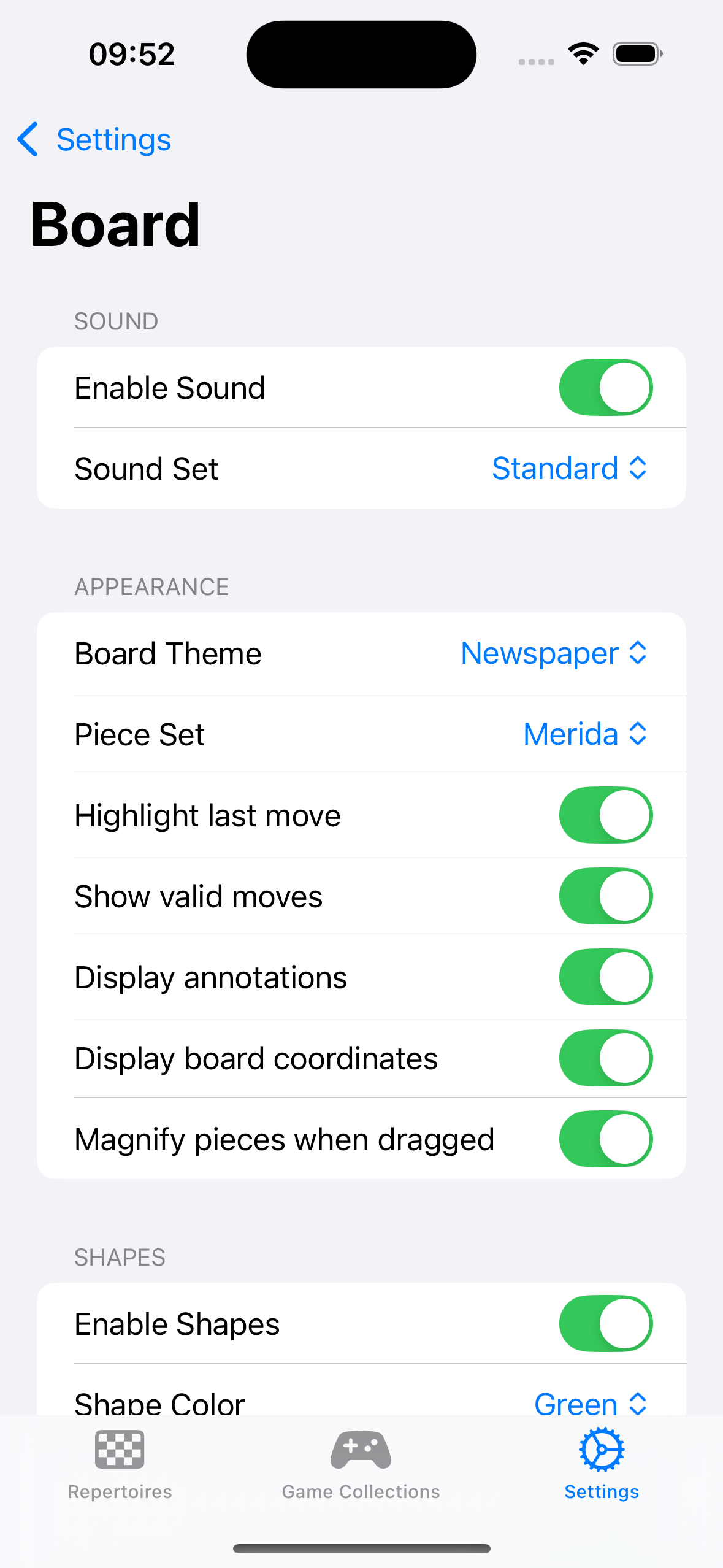
Thanks to the declarative nature of SwiftUI I was able to build a full-blown theming system for the board as well. Whenever my theme property changes the board gets redrawn and will be updated. To retrieve the currently selected theme I can fetch the board settings from the environment:
public extension EnvironmentValues {
    @Entry var boardSettings: BoardSettings = .init(
        isLastMoveHighlightEnabled: true,
        isValidMovesHighlightingEnabled: true,
        isBlindfoldMode: false,
        isShapeDrawingEnabled: true,
        shapeDrawingColor: .green,
        isAnnotationDrawingEnabled: true,
        isCoordinateDrawingEnabled: true,
        isMagnifyingDraggedPiecesEnabled: true,
        boardTheme: .blue,
        pieceSet: .cburnett
    )
}

 BoardView(model: model.boardModel)
    .environment(\.boardSettings, boardSettings)

// In BoardView:
@Environment(\.boardSettings) private var boardSettings
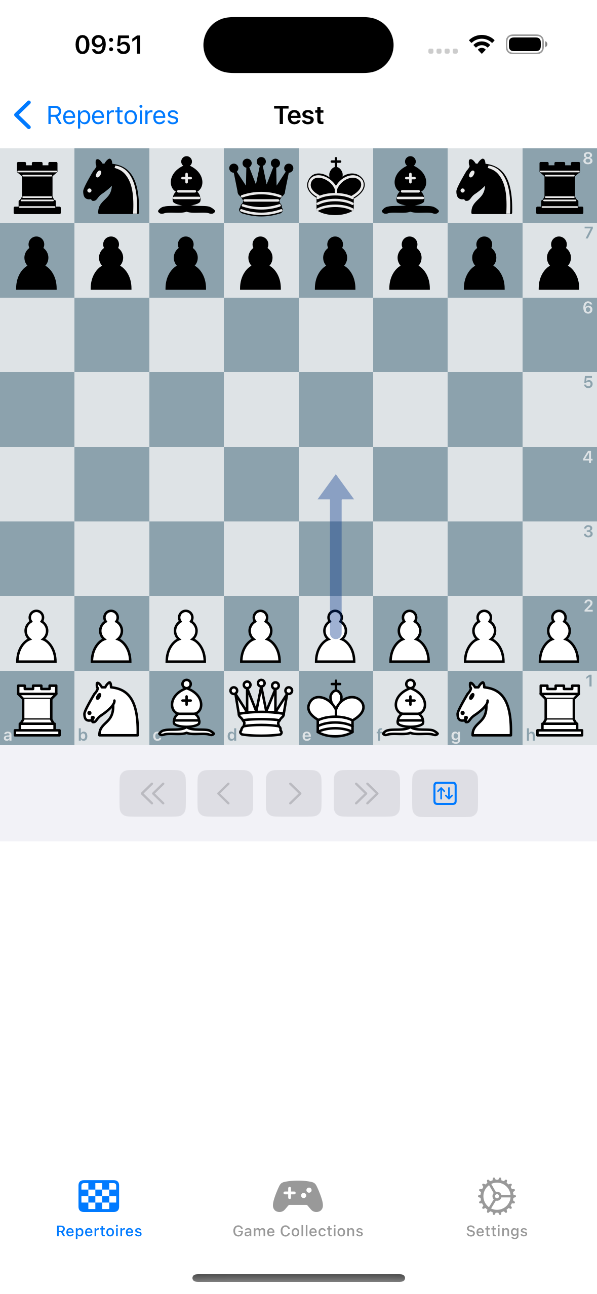
|
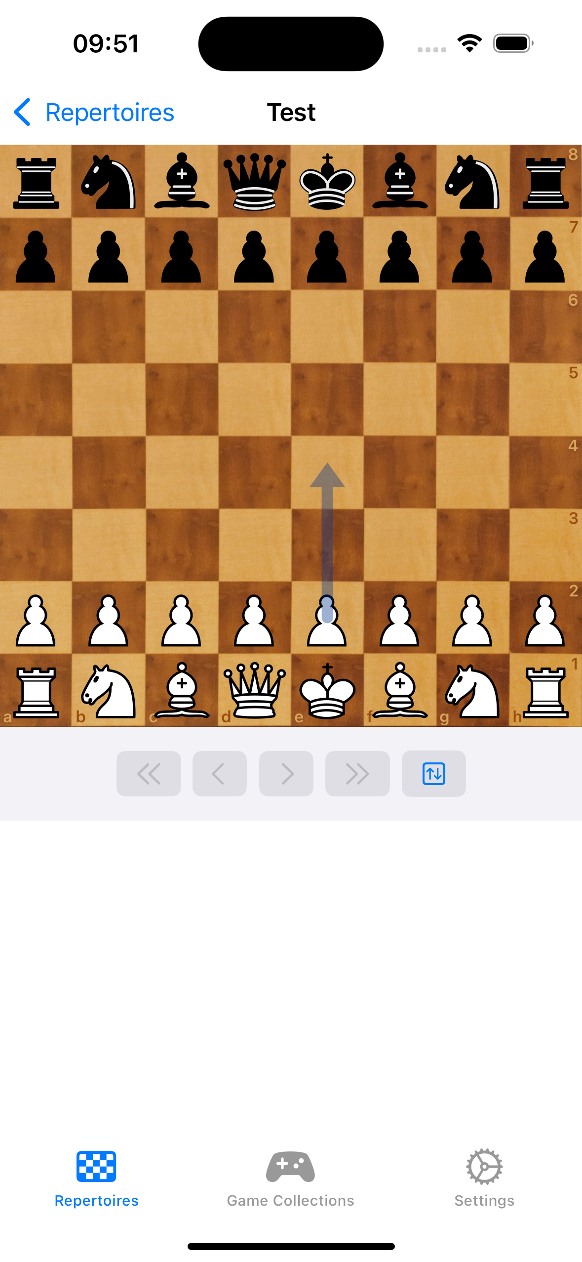
|
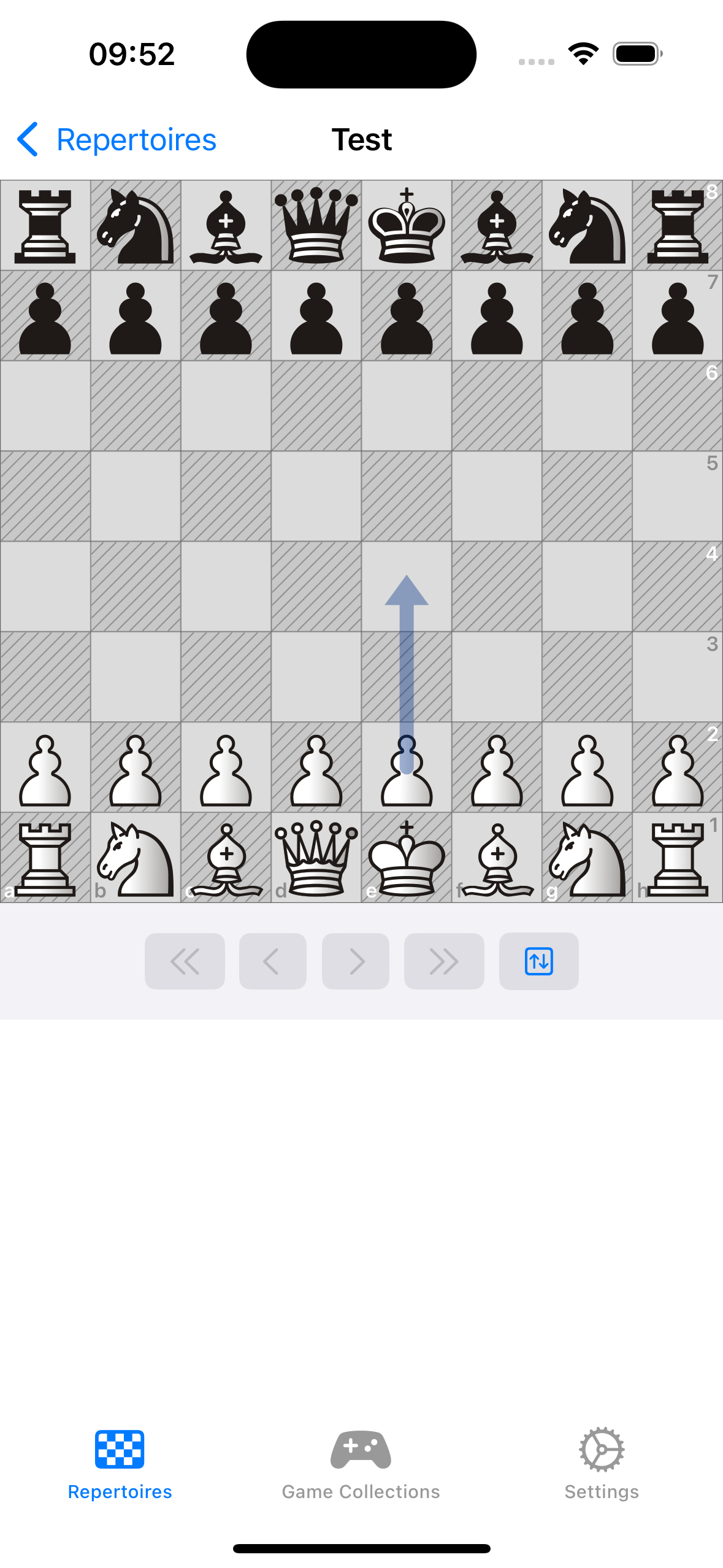
|
|
To display the current piece information on the board I pass a FEN string to my data model which makes use of the package we talked about in Part 3 of this series to parse the encoded information into a chess position which I then can use to draw the piece images on the board.
func set(fen: String) {
    let newPieces = FENParser.parsePieces(from: fen)
    withAnimation(.linear(duration: 0.1)) {
        self.preparePieceAnimation(oldPieces: pieces, newPieces: newPieces)
    } completion: {
        self.resetPieceAnimation()
        self.pieces = newPieces
    }
}

@ViewBuilder private var pieces: some View {
    ForEach(Array(model.pieces), id: \.0) { (squareId, piece) in
        PositionedSquare(
            squareSize: squareSize,
            squareId: squareId,
            orientation: model.orientation) {
                AnimatedPieceImage(
                    isEnabled: !isDragging,
                    isFading: model.isFading(at: squareId, piece: piece),
                    translation: model.translation(for: squareId, piece: piece, squareSize: squareSize)) {
                        PieceImage(
                            piece: piece,
                            pieceAssets: boardSettings.pieceSet.assets,
                            isBlindfoldMode: boardSettings.isBlindfoldMode
                        )
                        .animation(.linear(duration: 0.25), value: draggedSquareId)
                        .opacity(draggedSquareId == squareId && isDragging ? 0.5 : 1)
                    }
                }
    }
}
Promotion Handling
When a pawn moves to the opponents backrank it promotes to either a bishop, knight, rook or a queen. I actually quite like how lichess handles this. Most of the chessboard implementations show a modal to choose the promotion piece. However on lichess an inline representation is displayed and I quite like the user experience of that.
Thanks to SwiftUI displaying this on the board is just a matter of conditionally including the promotion picker view in a ZStack to overlay the board with the picker component.
Animations
When talking about animations I specifically mean the piece animation when moving a piece from one square to another. SwiftUI already comes with a builtin animation engine which can be used to accomplish this task. Whenever the chess board will be updated with a new FEN I calculate all translating and fading (captured) pieces and store them in a property. Moving on I use this information to animate the position of the piece. Once the animation completes I reset the calculated properties and apply the new FEN position to the board.
For completeness sake here is the respective code snippet:
func preparePieceAnimation(oldPieces: Pieces, newPieces: Pieces) {
    var newOnSquare: Pieces = [:]
    var missingOnSquare: Pieces = [:]
    var animatedOrigins: Set<SquareId> = .init()

    for squareId in SquareId.all {
        let oldPiece = oldPieces[squareId]
        let newPiece = newPieces[squareId]
        if let newPiece {
            if let oldPiece {
                if newPiece != oldPiece {
                    missingOnSquare[squareId] = oldPiece
                    newOnSquare[squareId] = newPiece
                }
            } else {
                newOnSquare[squareId] = newPiece
            }
        } else if let oldPiece {
            missingOnSquare[squareId] = oldPiece
        }
    }

    for (newPieceSquareId, newPiece) in newOnSquare {
        if let fromSquareId = closestSquare(
            squareId: newPieceSquareId,
            from: Set(missingOnSquare.filter({ $0.1 == newPiece }).keys)
        ) {
            translatingPieces[newPieceSquareId] = (fromSquareId, newPiece)
            animatedOrigins.insert(fromSquareId)
        }
    }

    for (missingPieceSquareId, missingPiece) in missingOnSquare {
        if !animatedOrigins.contains(missingPieceSquareId) {
            fadingPieces[missingPieceSquareId] = missingPiece
        }
    }
}

func distanceSq(from: SquareId, to: SquareId) -> Int {
    let fromCoordinate = Coordinate(squareId: from)
    let toCoordinate = Coordinate(squareId: to)
    let dx = fromCoordinate.x - toCoordinate.x
    let dy = fromCoordinate.y - toCoordinate.y
    return dx * dx + dy * dy
}

func closestSquare(squareId: SquareId, from squares: Set<SquareId>) -> SquareId? {
    guard !squares.isEmpty else { return nil }
    return squares.min {
        distanceSq(from: squareId, to: $0) < distanceSq(from: squareId, to: $1) ? true : false
    }
}

func resetPieceAnimation() {
    self.translatingPieces.removeAll()
    self.fadingPieces.removeAll()
}
And the result looks like this:
Shapes
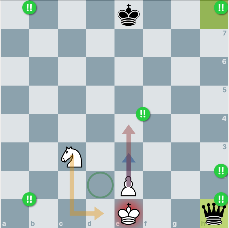
One feature you see in full featured chessboard implementations is the ability to draw shapes on the board. They help visualizing a plan or to explain concepts to a chess player. This is the reason why the PGN file format was supplemented with specific commands encoded in the comments section of a move. Two of those commands deal with drawing a circle or an arrow on the board. Here are two examples:
-
[%cal Gc2c3,Rc3d4]: Draw a coloured arrow in green from c2 to c3 and a red arrow from c3 to d4
-
[%csl Ra3,Ba4]: Draw a coloured circle in red on a3 and a blue circle on a4
Since the circle shape already exists in SwiftUI all that was left for me to implement was the arrow shape. I created a custom shape component and implemented it with a Path view:
var body: some View {
    let start = Coordinate(squareId: configuration.origin)
    let startPoint = start.offset(orientation: orientation, squareSize: squareSize)
    let end = Coordinate(squareId: configuration.destination)
    let endPoint = end.offset(orientation: orientation, squareSize: squareSize)
    let arrowAngle = CGFloat(Double.pi / 5)

    let rankDistance = end.x - start.x
    let fileDistance = end.y - start.y
    let isKnightMove = (abs(rankDistance) == 2 && abs(fileDistance) == 1) || (abs(rankDistance) == 1 && abs(fileDistance) == 2)

    Path { path in
        var delta: CGPoint
        path.move(to: startPoint)

        if isKnightMove {
            let dx = endPoint.x - startPoint.x
            let dy = endPoint.y - startPoint.y
            let horizontalFirst = abs(dx) > abs(dy)
            let turnPoint = horizontalFirst ? CGPoint(x: endPoint.x, y: startPoint.y) : CGPoint(x: startPoint.x, y: endPoint.y)
            path.addLine(to: turnPoint)
            delta = CGPoint(
                x: endPoint.x - turnPoint.x,
                y: endPoint.y - turnPoint.y
            )
        } else {
            delta = CGPoint(
                x: endPoint.x - startPoint.x,
                y: endPoint.y - startPoint.y
            )
        }

        // Draw Triangle
        let pointerLineLength = squareSize.width * 0.15625
        let angle = atan2(delta.y, delta.x)
        let arrowLine1 = CGPoint(
            x: endPoint.x + pointerLineLength * cos(CGFloat(Double.pi) - angle + arrowAngle),
            y: endPoint.y - pointerLineLength * sin(CGFloat(Double.pi) - angle + arrowAngle)
        )
        let arrowLine2 = CGPoint(
            x: endPoint.x + pointerLineLength * cos(CGFloat(Double.pi) - angle - arrowAngle),
            y: endPoint.y - pointerLineLength * sin(CGFloat(Double.pi) - angle - arrowAngle)
        )

        let triangleCenter = ((arrowLine1.x + endPoint.x + arrowLine2.x)/3, (arrowLine1.y + endPoint.y + arrowLine2.y)/3)
        path.addLine(to: CGPoint(x: triangleCenter.0, y: triangleCenter.1))
        path.move(to: arrowLine1)
        path.addLine(to: endPoint)
        path.addLine(to: arrowLine2)
        path.closeSubpath()
    }
    .strokedPath(StrokeStyle(lineWidth: squareSize.width * 0.15625, lineCap: .round, lineJoin: .miter))
    .foregroundColor(configuration.color.color)
}
The result allows to not only colour the shape in any colour I'd like it also scales to the boards dimension due to the inclusion of the square size. Besides that I also draw a different path for a typical knight move as this is something I saw on the online platform chess.com and I quite liked this.
Move Notation
The last challenge I want to talk about is to display the move notation below or next to the board. The actual string representation of a chess game is something I added to my chess logic package. Internally I store a chess game in some kind of tree structure which I can traverse and build the SAN representation of every given move. If you look at it the implementation boils down to a parser printer as this is pretty similar to our PGN parser, just in reverse order.
However the real challenge I faced was to display this string representation with SwiftUI. My goal was to maintain the flow layout a text has while being able to decorate specific ranges of the string with different foreground and background colours. Also a specific move needs to be selectable so I can quickly jump to the position in the game. Lets quickly examine the available options and why they did not work for me:
-
For each move render a button component which can receive an action and can be styled to the specific needs.
-
For each move render a seperate text component which can be styled with a foreground and background color. To implement the click action the
onTapGestureview modifier can be used.
Both options did not work for me because because I lose the flow layout a Text typically is rendered with. I could use the Layout protocol of SwiftUI to recreate this but ultimately decided against it.
The solution I found was to use an AttributedString to display the move notation in a single text component. Styling attributes like foreground color and background color are part of the AttributedString and a Text component in SwiftUI already has an initializer to display it. To be able to select a specific range in the text and execute an action on it I encoded a link attribute in the attributed string with a deeplink. Further I implemented a custom onOpenUrl action to handle the received deeplink and with that the move notation seems rather usable.
struct GameNotationView: View {
    let model: GameModel

    var body: some View {
        Text(model.attributedMoveNotation)
            .environment(\.openURL, .init(handler: handle(_:)))
    }

    private func handle(_ url: URL) -> OpenURLAction.Result {
        guard url.scheme == AppConfiguration.urlScheme else {
            return .discarded
        }

        guard url.host() == "node" else {
            return .discarded
        }

        let path = url.path().dropFirst(1)
        guard let nodeId = UUID(uuidString: String(path)) else {
            return .discarded
        }

        model.goTo(nodeId: nodeId)

        return .handled
    }
}
One thing I would like to revisit at a later time is the limitation that an attributed string has no way of specifying a corner radius for the background color. I think I might be able to leverage this years addition to the SwiftUI framework TextRenderer to accomplish the design I have in mind but for now the solution is "good enough" for my needs.